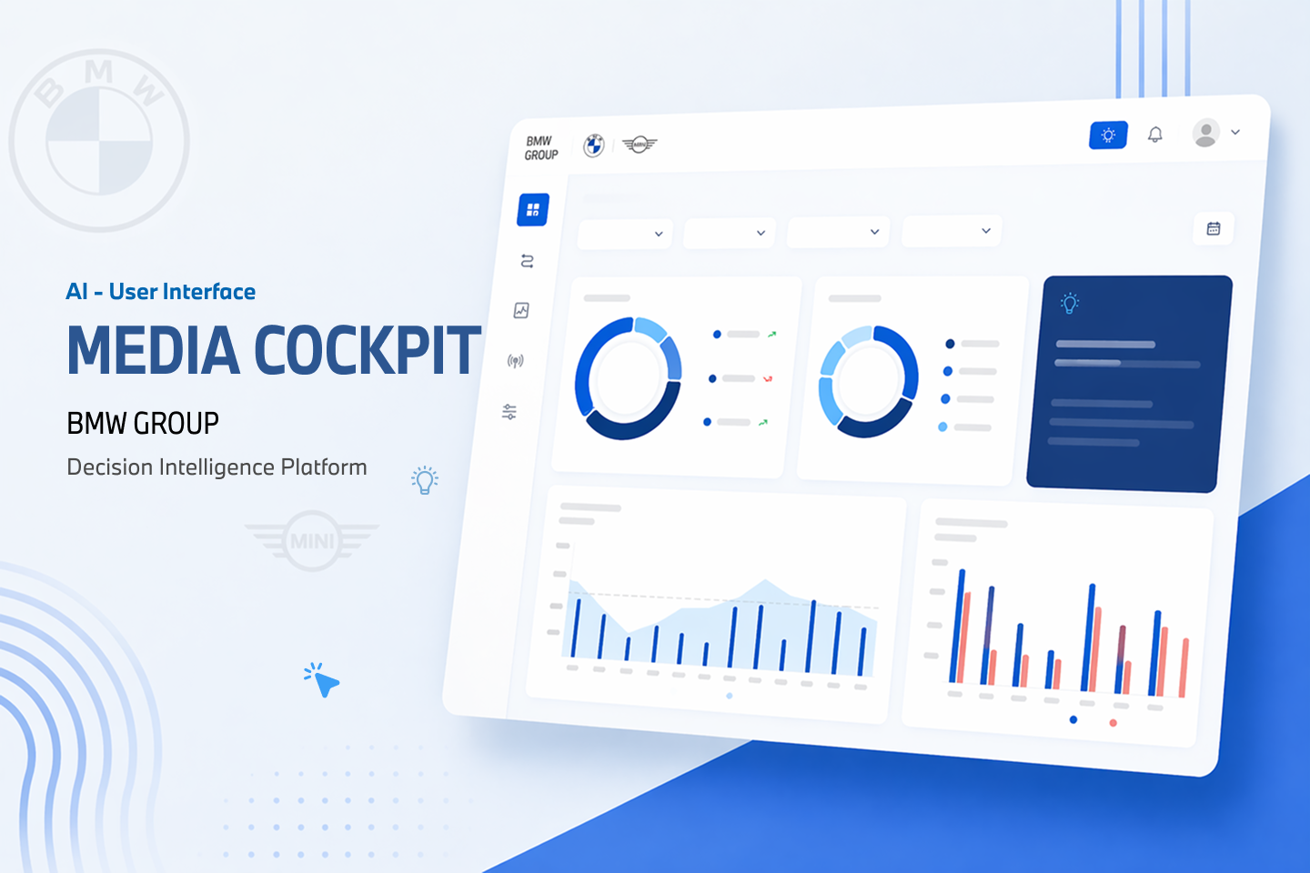
BMW Media Cockpit
— Decision Intelligence Platform
BMW's global media teams were making multi-million euro campaign decisions using fragmented data, manual exports, and gut instinct. I designed an AI-powered decision support system that replaced scattered reporting with a single platform for insight, simulation, and confident action.
What BMW needed and why it mattered
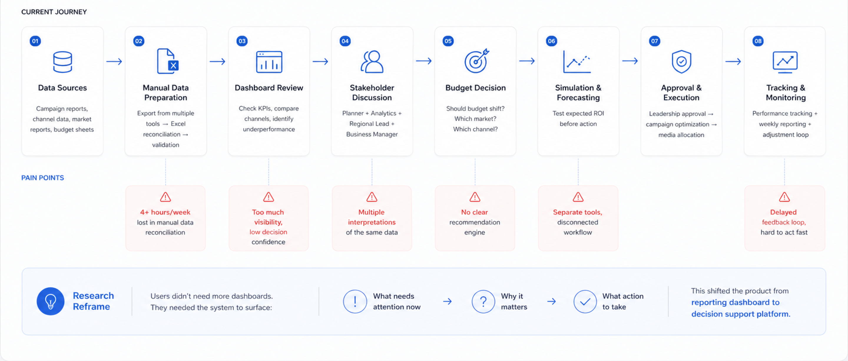
BMW manages media campaigns across 12+ markets, multiple brands (BMW, MINI, Rolls-Royce), and 4+ channels simultaneously. The scale of this operation means that even a 1% improvement in budget allocation efficiency translates to millions in recaptured value. At the time I joined this project, none of that optimisation was possible in real time.
I was brought in as the lead designer at WNS Global's SaaS product division — working directly with the BMW Group client team, product management, and a lean engineering squad. This was a greenfield product, not a redesign. Which meant the first challenge was also the most important: defining what problem we were actually solving.
More data, fewer decisions
Before running a single interview, I audited the existing workflow. Media planners across markets were using a combination of Excel exports, local BI tools, and email threads to coordinate campaign decisions. The problems were structural, not just UX.
"We spend more time preparing data for the meeting than actually making decisions in it."
— BMW Media Planner, Germany (research interview)
Specific financial figures are protected under NDA. All metrics shown are directional and anonymised.
Understanding how media teams actually decide
Two weeks before touching Figma, I ran a structured discovery phase. The goal wasn't to validate a solution — it was to build an accurate mental model of how media decisions actually get made under pressure.
What I did
Where I spent my thinking time
Framing the design challenge correctly
Before sketching anything, I ran a structured workshop with the PM and business lead to define: what constitutes a "good" campaign decision? What triggers a reallocation? What's the confidence threshold? Who approves what? This session produced a decision taxonomy that became the backbone of the information architecture.
The critical architectural decision
Three interface directions competed for the primary design paradigm. I evaluated each against user research, technical constraints, and business goals:
Design system — a deliberate early investment
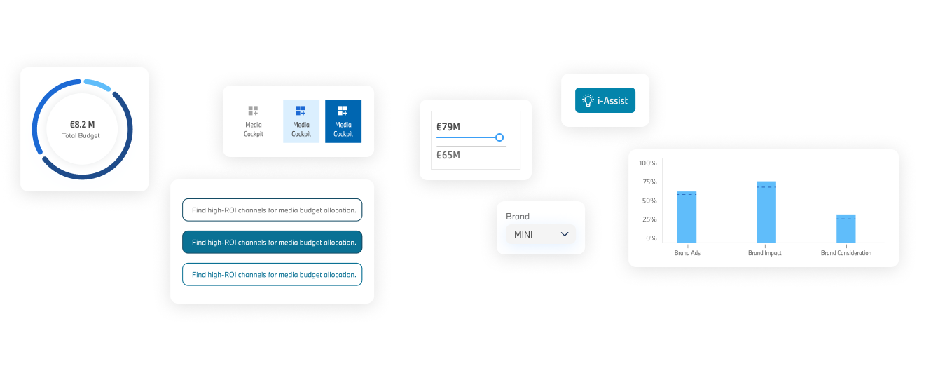
The product spans four modules: dashboard, simulation engine, campaign planner, and reporting. Early in sprint 2, I noticed visual and component drift forming between modules — conflicting spacing, inconsistent data table patterns, different chart styles. I paused feature work for one sprint to establish a shared component library and design token system in Figma before continuing.
This cost a sprint upfront. It saved an estimated three sprints of rework later, and meant engineering had a consistent reference across the entire product.
Using AI to accelerate design exploration
I used Claude for rapid design critique — feeding it annotated screenshots and asking it to challenge assumptions before I moved to high fidelity. I used ChatGPT to draft and stress-test IA options, generate edge case user scenarios, and structure research synthesis. These tools didn't replace design judgment — they compressed the time between a rough idea and a pressure-tested one.
From passive reporting to active decision support
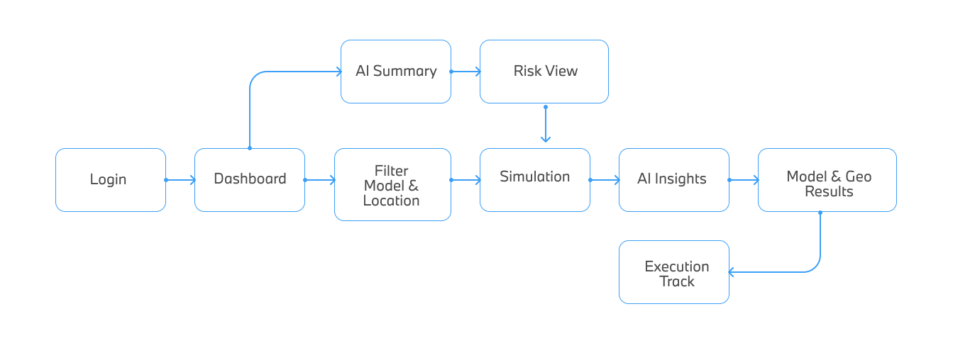
The final product is structured around three interconnected layers — each building on the last to give users just enough context to act with confidence, not just awareness.
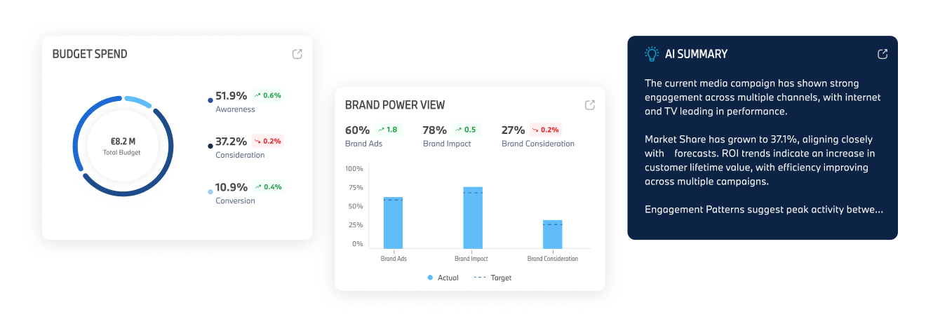
Layer 1 — Situation awareness (Dashboard)
The dashboard leads with an AI-ranked alert feed ordered by urgency and potential impact — not by recency. Users see what needs attention before they see what's fine. Each alert is expandable inline to show the supporting data trail behind the recommendation, without requiring navigation away from the feed.
Layer 2 — Simulation engine
Before committing to a budget decision, users can model its projected impact in real time. The simulation runs against historical performance and predictive data, returning a confidence score and projected outcome range. This was the feature most requested in research and most absent from existing tools. The design goal was simple: eliminate decision anxiety by making the cost of exploring options near zero.
Layer 3 — Execution & feedback loop
Once a decision is made and a budget shift is approved, it's tracked end-to-end in the platform. Post-execution performance is automatically fed back into the AI model to calibrate future recommendations. This closed loop was essential for building user trust in AI over time — each acted-on recommendation that paid off made the next one easier to accept.
What changed after launch
Metrics are directional due to NDA. Specific figures available to discuss during interview.
What I'd do differently
Every project teaches you something only visible in hindsight. These are my honest take-aways from this one.
The hardest part of this project wasn't the design. It was convincing stakeholders to invest in the simulation engine before building the dashboards — everyone wanted to see screens first. I had to hold that position with research evidence for two weeks before getting the green light. That experience, learning to defend a design rationale against pressure with evidence rather than opinion, was the most valuable thing I took from this project.
Explore more projects