HEX — Unified
Design Experience
Three products. Eight designers. Zero shared language. I built HEX — a token-based, multi-product design system — that turned fragmented interfaces into one scalable foundation that design and engineering could build on and trust.
Before HEX, there was organised chaos
When I joined WNS Global's SaaS product division, the organisation was shipping three distinct enterprise products — each built by a different team, each with its own visual language, component patterns, and Figma file structure. On the surface, it worked. Under the surface, it was compounding debt with every release.
New features took twice as long to design because nothing reused. Engineering received designs from different files with different naming conventions, conflicting spacing values, and inconsistent component logic. Every designer had developed their own shortcuts. The three products had diverged to the point where a user moving between them encountered three different interaction models, three colour systems, and three ways to read a data table.
"Each team had built their own version of the same button. We were shipping inconsistency as a feature."
— Senior Engineer, WNS Global
HEX was not a cosmetic project. It was a structural intervention — one that required buy-in from engineering, product management, and the business before a single component was designed.
Five failure modes, one root cause
I spent the first two weeks auditing — not designing. A systematic inventory across all three products surfaced five recurring failure modes, all symptoms of the same root cause: the absence of a shared design language.
I led the system. And that meant everything.
This was a solo design ownership project. I was the single designer responsible for architecting HEX from foundation design through to component library, documentation, and engineering handoff. The team — two engineers, a PM, and input from the broader design group — were collaborators, not co-owners of the system.
My responsibilities spanned the full lifecycle: design audit and research, foundation architecture (colour, typography, spacing, radius, shadow, iconography), token schema design, component design in all states, documentation, engineering collaboration, and the rollout strategy across three live products.
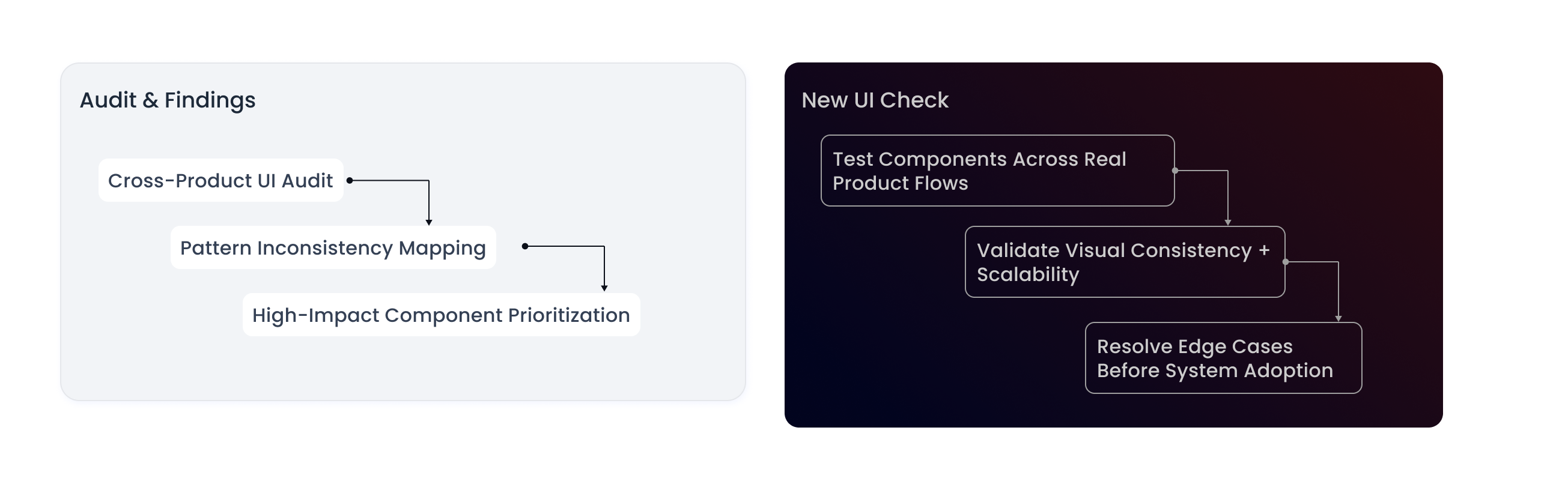
You cannot design what you haven't measured
Before proposing any direction, I ran a structured audit across all three products. The goal was twofold: quantify the inconsistency to build the case for investment, and identify which components were highest-frequency — so prioritisation was evidence-based, not intuitive.
Component inventory
I catalogued every unique UI state across the products and cross-referenced Figma files to count implementations per component. The result: 6 button implementations, 4 input field variants with different focus states, 3 modal patterns with conflicting overlay behaviour, and no consistent data table implementation across any two products.
Stakeholder interviews
Short interviews with 4 engineers and 3 product designers surfaced a consistent theme: designers spent too long searching for the "right" component version to copy. Engineers built from scratch when handoffs were ambiguous. Both groups wanted a single source of truth — but didn't believe it was achievable given the product complexity. That scepticism was the real problem to solve before anything else.
Build from scratch, or converge the existing?
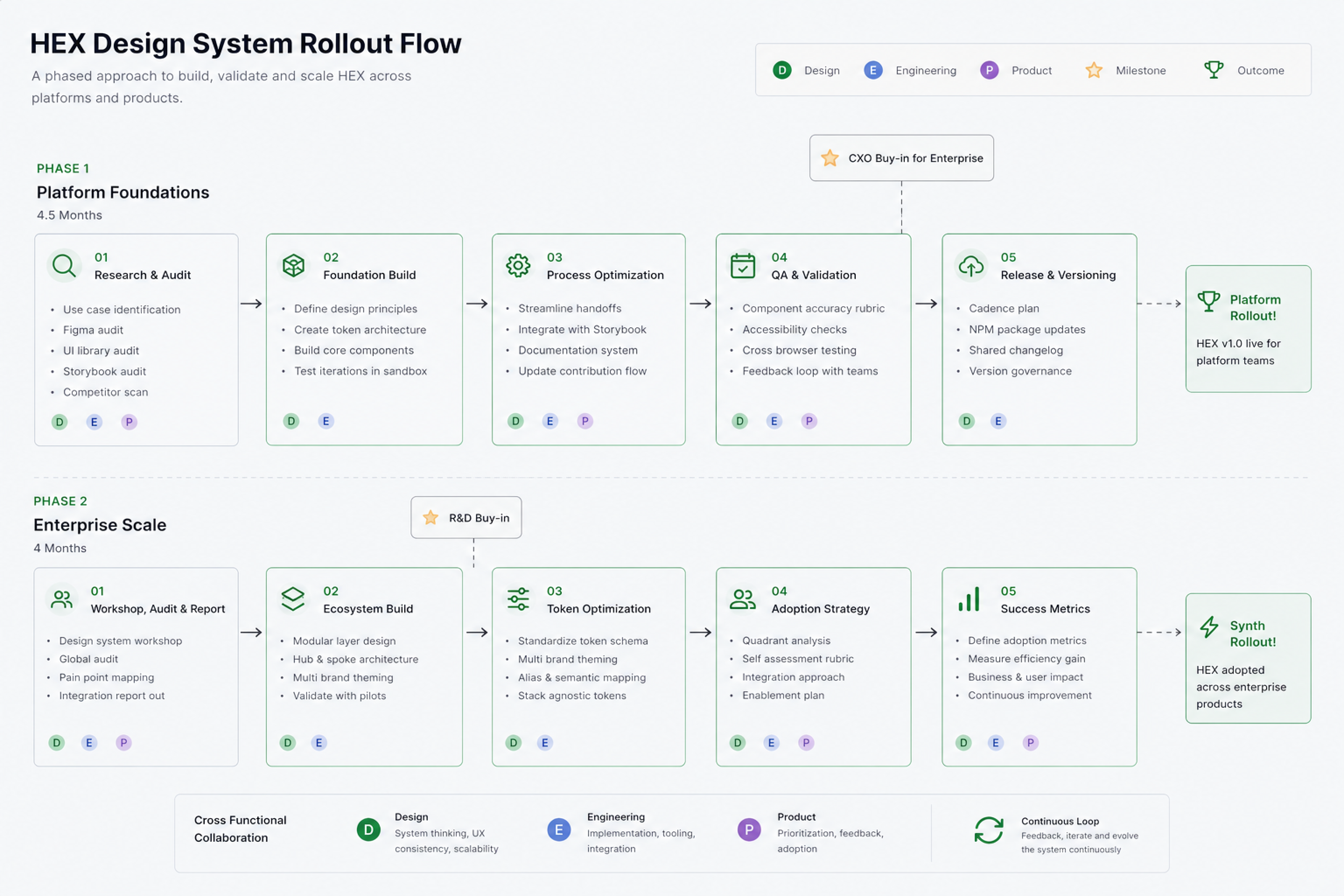
The most consequential design decision on this project wasn't about a component — it was about the approach. Three options competed for the architecture direction, each with real tradeoffs for engineering migration cost, designer adoption speed, and long-term system health.
The chosen approach meant designing a three-tier token system that could sit beneath the existing component logic — allowing incremental adoption rather than a big-bang migration that would stall product delivery for months.
Not linear. Deliberately parallel.
Design systems built in isolation from product work fail at adoption. I designed the HEX process to run alongside feature delivery — so every new product feature became a vehicle for rolling out system components, and every component built for the system had an immediate real-world use case to validate against.
A strong system starts with strong DNA
Foundations are the decisions that everything else inherits. Get them wrong and every component compounds the error at scale. I treated the foundation phase as the highest-leverage work in the entire project — spending disproportionate time here to ensure the components built on top would be self-consistent by design.
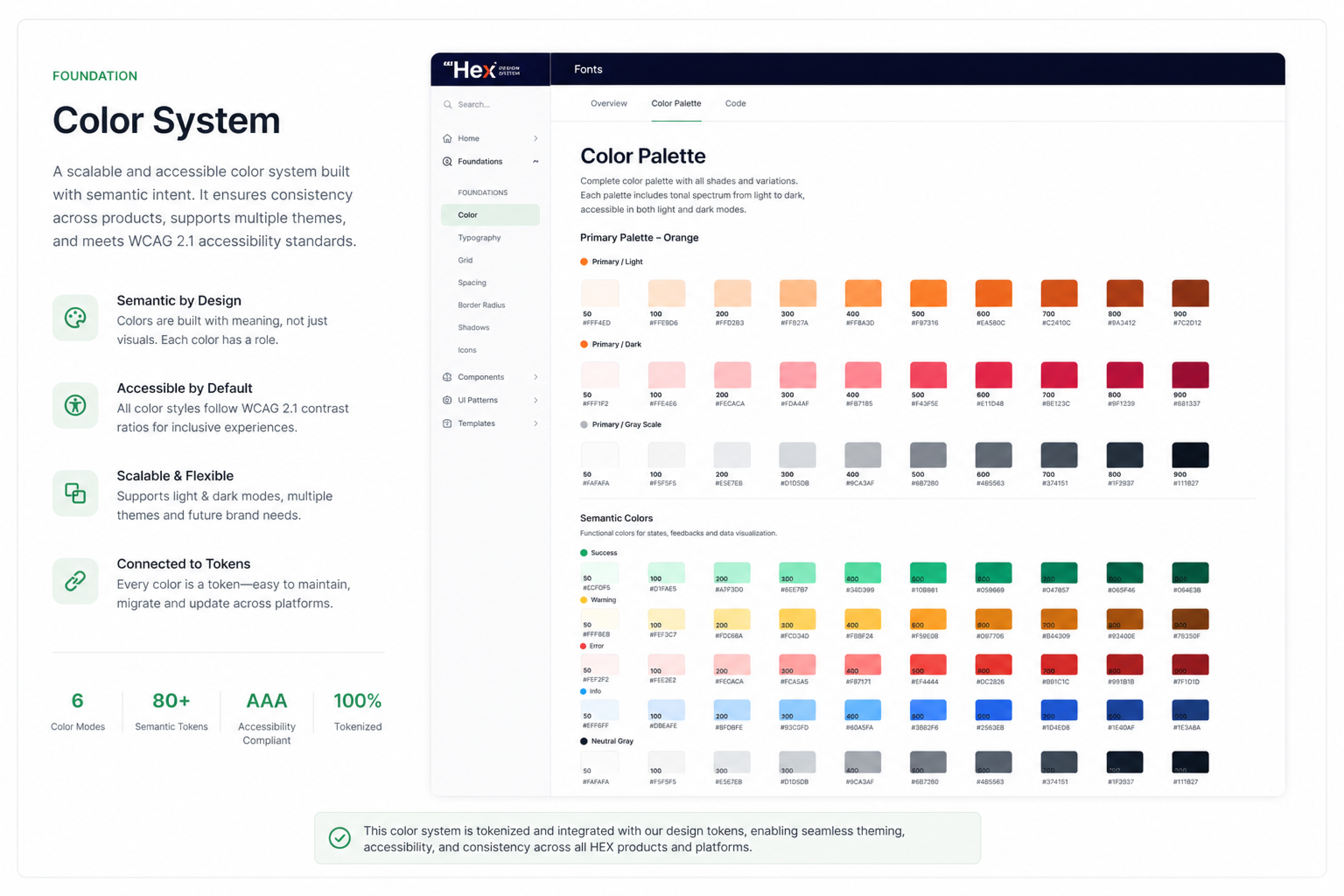
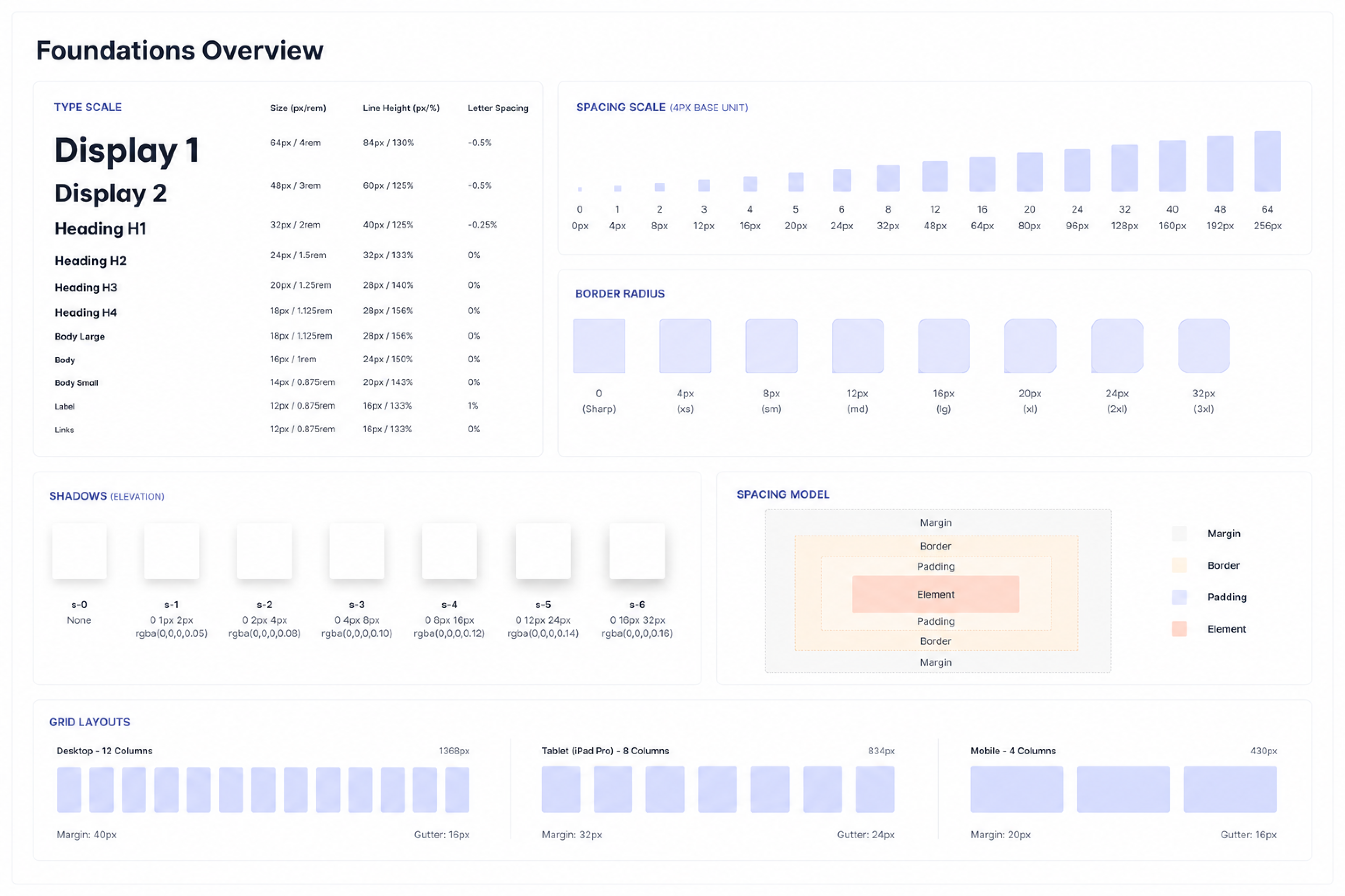
Tokens are the why behind every value
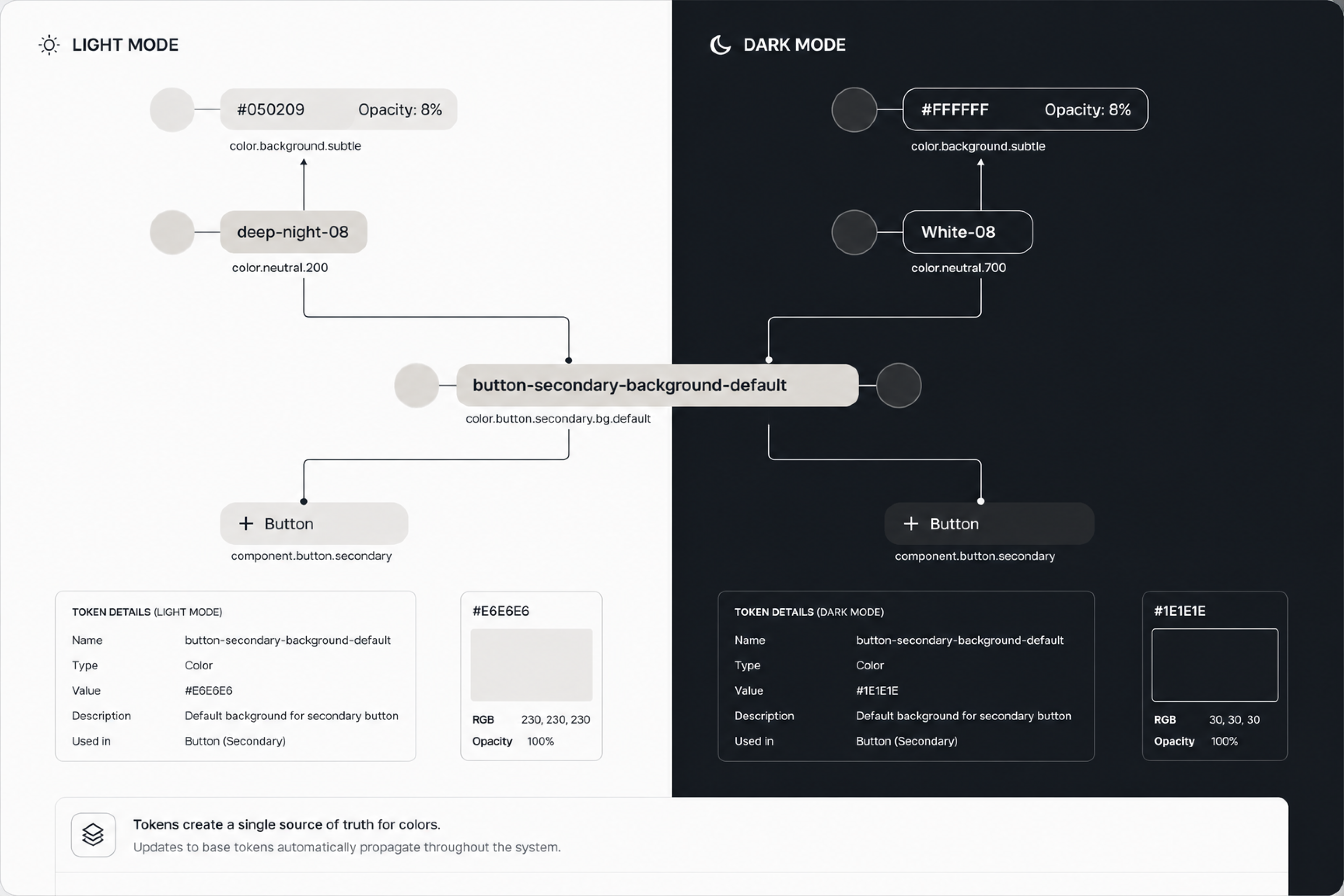
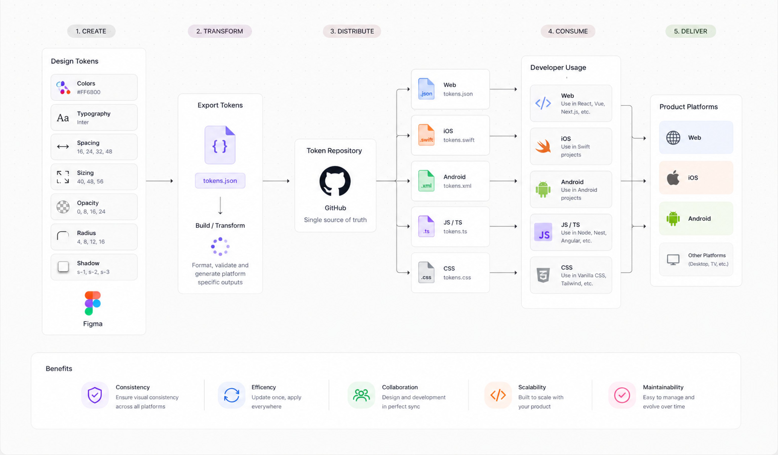
A colour system without tokens is just a style guide that eventually gets ignored. Tokens turn design decisions into a shared contract between design and engineering — one that survives product scale, team changes, and new themes. I designed HEX around a three-tier model, where primitive values, semantic intent, and component-scoped overrides are kept deliberately separate.
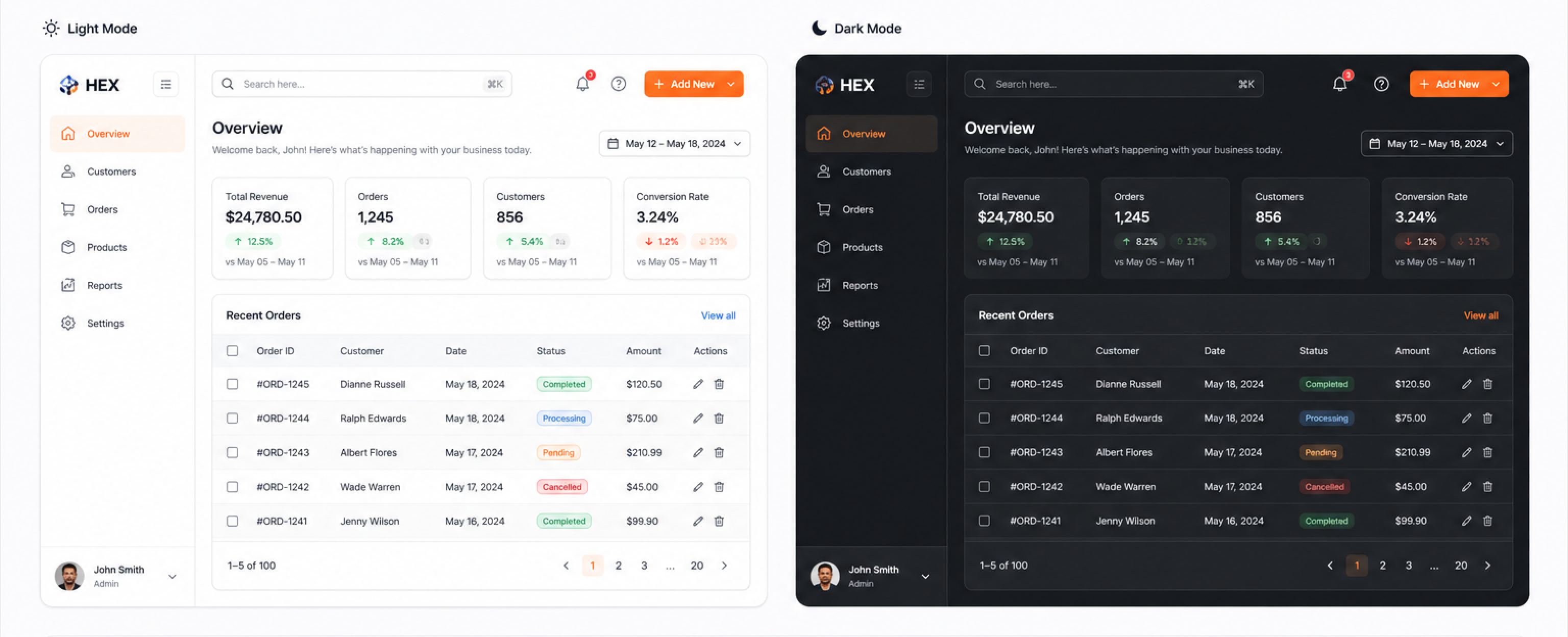
Why three tiers matter for dark mode and theming
Dark mode is where flat token systems collapse. Because HEX separates primitive values from semantic intent, switching from light to dark only requires remapping the semantic tier — no component logic changes. A single JSON file swap at the semantic layer changes the entire product theme across all three products simultaneously.
Token pipeline — design to production
The reusable DNA of the product experience
With foundations and tokens in place, I built the 12 priority component families — each with all interactive states, responsive behaviour, dark mode, and full Figma documentation. Every HEX component is token-attached (zero hardcoded values), documented with usage guidelines and do/don't examples, and has an agreed engineering implementation that can be referenced from Storybook.
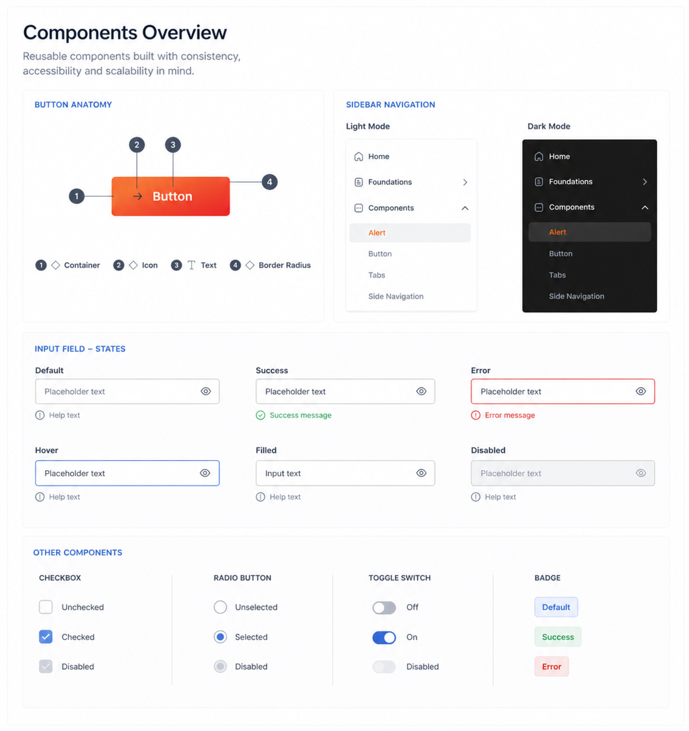
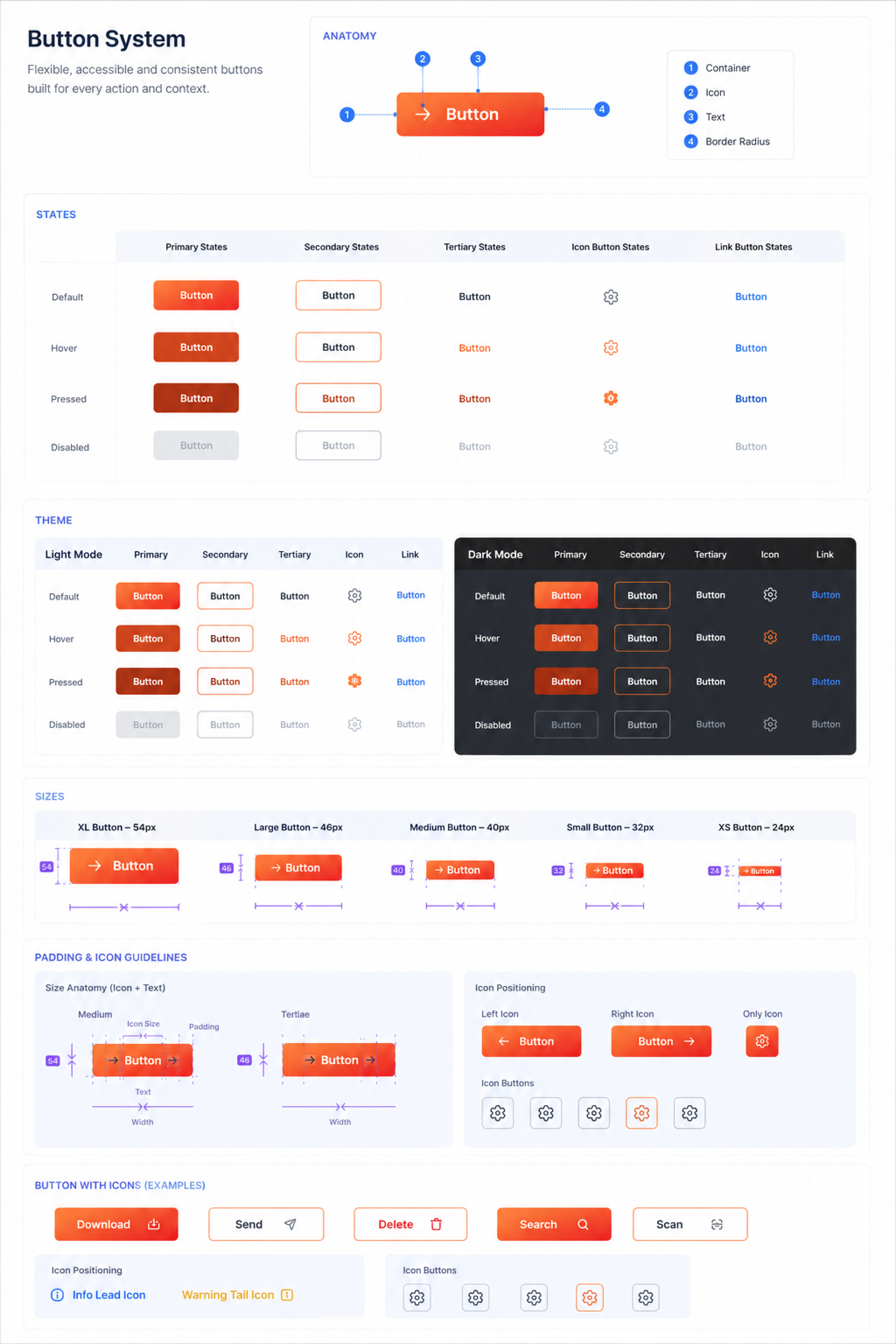
Button system — the hardest component to standardise
Buttons were highest-priority and most contentious. Six implementations across three products had different heights, padding values, and icon positioning logic. The HEX button system unifies these into a single Figma component with properties: 4 variants (primary, secondary, ghost, destructive), 3 sizes, 5 states (default, hover, pressed, disabled, loading), and icon-left, icon-right, icon-only configurations — one source, all contexts.
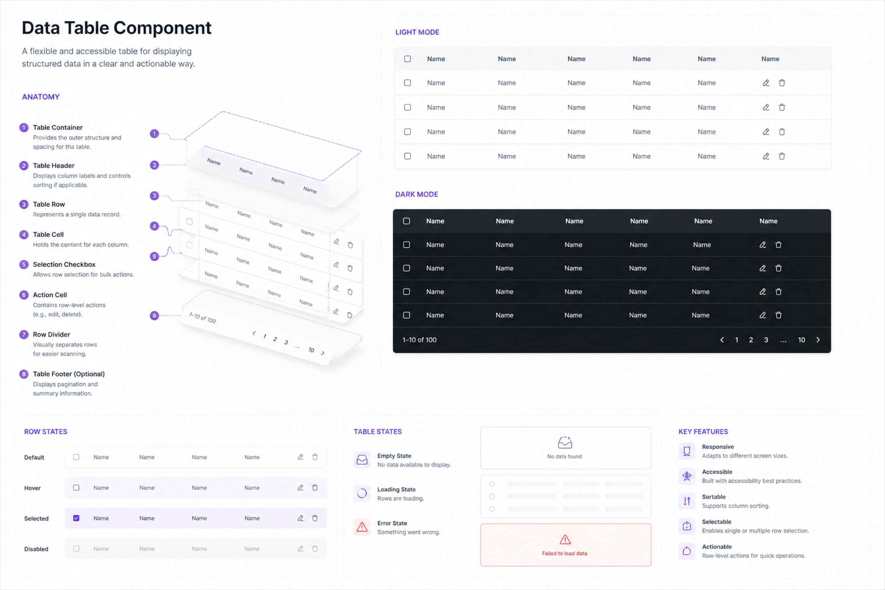
Data table — the enterprise workhorse
Tables are the highest-frequency component in enterprise SaaS and the most common source of visual inconsistency. The HEX table covers sortable and non-sortable columns, row selection, inline actions, sticky headers, empty states, loading states, and pagination — all in one compound component with clearly defined composition slots.
A system that lives in code and Figma equally
A design system that only lives in Figma is a style guide. One that only lives in code is a component library. HEX needed to be both — with a clear, async-friendly contract between the two that didn't require a synchronous meeting every time something needed to ship.
Documentation built to work without a walkthrough
Working remotely, I built every component spec to be self-sufficient — annotating not just spacing values but the why behind decisions, what edge cases to watch for, and explicit do/don't examples. This documentation investment upfront eliminated the back-and-forth that had previously stretched handoffs across days into single-pass reviews.
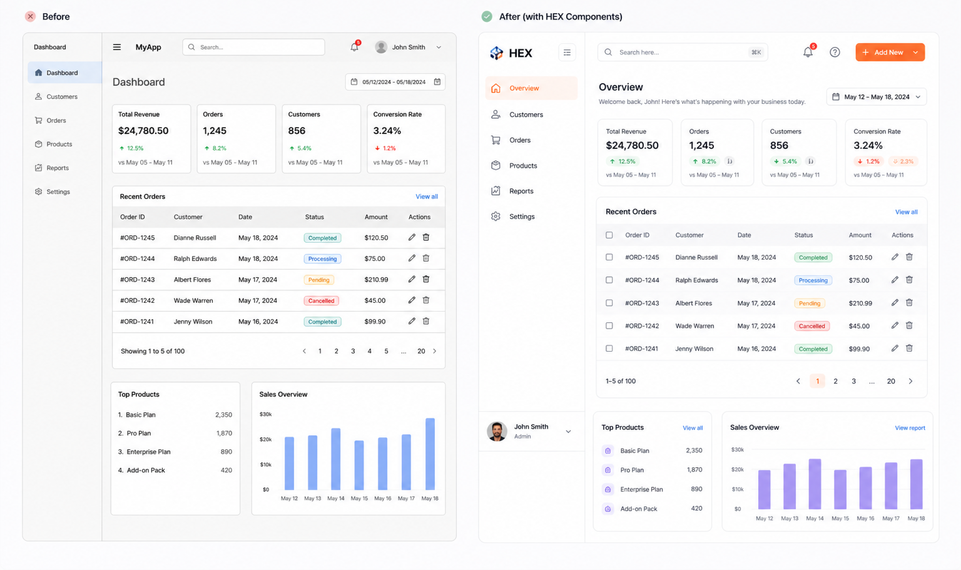
What HEX changed in practice
The clearest measure of a design system's success is adoption. HEX was fully adopted by all eight designers within 3 weeks of launch and incrementally rolled out across all three products over 6 weeks. Engineering migrated all new feature work to HEX-based components immediately — legacy component migration is an ongoing background process.
What building a system at speed taught me
HEX was designed and shipped while I was simultaneously delivering feature work on a live product. That constraint forced prioritisation decisions I wouldn't have made in a pure systems project — and taught me things a dedicated design system sprint couldn't have.
The most important thing I learned: a design system is never finished. HEX at launch was a starting point, not a destination. The real work — maintaining it, evolving it, deprecating components that no longer serve real use cases — is what separates a system that scales from one that becomes another layer of debt. I built with that mindset from the beginning, and it changed how I made every decision.
Explore more projects